“Fonts” a single element that can add a charm to your design or can completely ruin it. The mistake that anyone should not make is to underestimate the power of FONTS.
In this article, we will take you through a step by step guide on how to use fonts to boost your social media performance.
Introduction (Typeface and Fonts)
If reading is a bit boring for you then this video will help you to clear your basic understanding of typography and fonts.
So let’s start
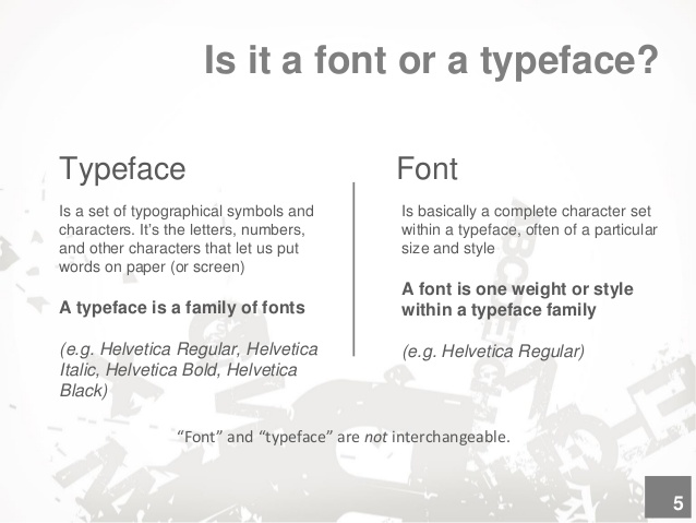
You might have seen this while making a report or writing on a word doc, there are so many fonts available for you to choose, but if you have observed some fonts give you options like bold, italic, regular etc and some font are a loner with no extra options.
The fonts with many options are called typeface and the loner is called font.
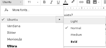
In the case below Ubuntu is known as typeface and Ubuntu light is a font
Different ways to classify typeface and type families

There are 3 ways to classify them
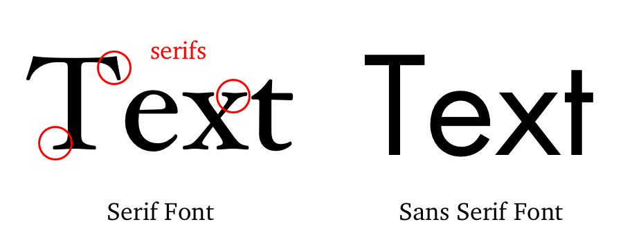
Serif font
A serif is a small line attached to the end of a stroke in a letter or symbol. A typeface with serifs is called a serif typeface (or serifed typeface). They are known for their classic look. You might have seen them in our school textbooks, magazines and newspapers.
Sans serif
A sans-serif’s are the one that does not have extended strokes at the end of letters. Sans-serif fonts tend to have less line width variation than serif fonts. This style is more clean, readable and modern as compared to serif fonts.
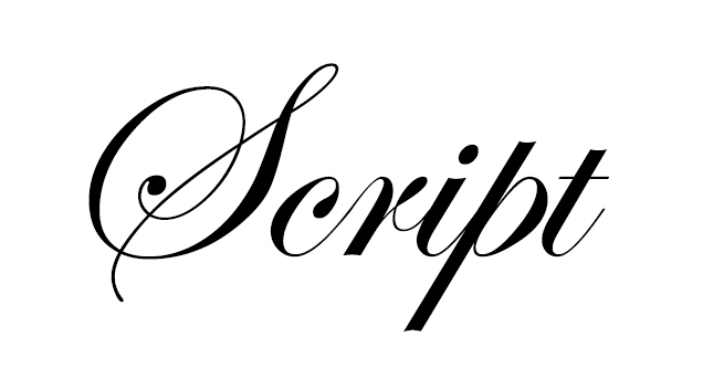
Script
Script typefaces are very decorative in nature they are best suited for creatives that have less amount of text.
Now we know the different types of fonts let’s fill you in with jargons used in typography.
Spacing
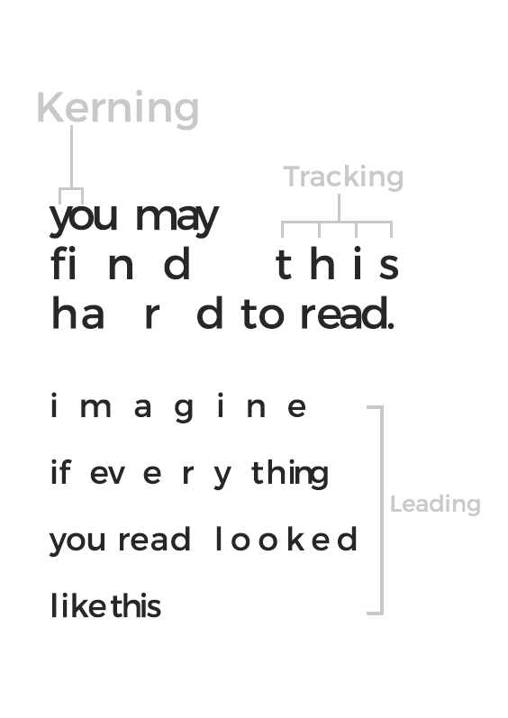
So in designing word spacings between letters and words are known as Kerning, Tracking and Leading.
Kerning
kerning is the process of adjusting the spacing between characters in a proportional font, usually to achieve a visually pleasing result.
Tracking
Tracking refers to uniformly increasing or decreasing the horizontal spacing between characters. As you can see in the image above.
Leading
Leading is a typography term that describes the distance between each line of text.
Good & Bad Use of Fonts
Let’s look at some good and bad examples of fonts used in creatives.
Fonts have their language and the only thing which matters is how you use them.
You can nail down your design even with a comic sans font only if you use it in a proper manner. Usually, people underestimate fonts and don’t see them as a design element that’s where the creatives lack the uniqueness.
You can make your designs look attractive only if you make a proper use of the font as you can see in the example below.
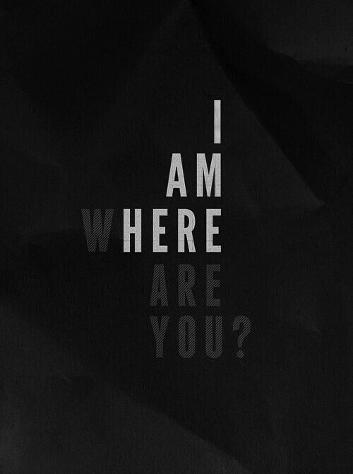
The above creative is just a font with Dark background and the message is delivered in a creative manner by just using the font.
There are a bunch of creative designs out there which shows how fonts have a great impact on your design in a positive or negative manner.
Take a look at the image given below
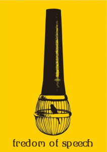
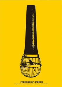
Designing is not rocket science there is no blueprint to create a perfect creative. The only thing is that you just need to understand the flow and the need of the creative.
For example, in the above image, you can see how bad font choice ruin the creative. The only thing you have to point your focus is, to understand which element is important, the image is more important or the copy of the image. The image will explain to you all.
Below are the Creative designed for some specific brands.

Just observe the above images and try to drive some conclusions out of it. 🙂
(waiting)
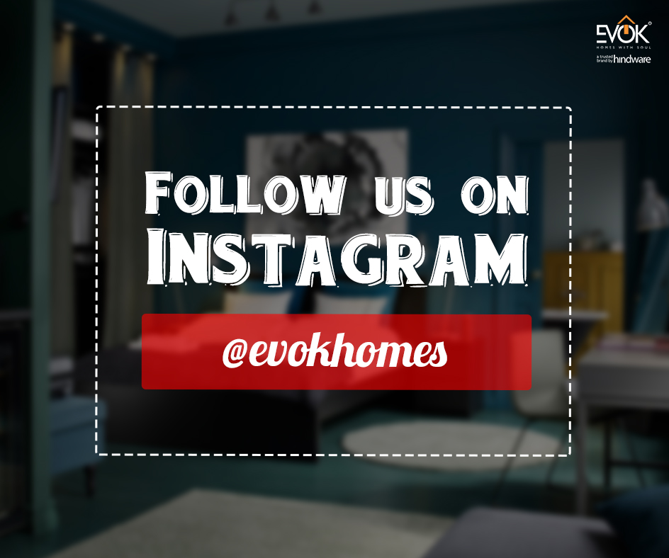
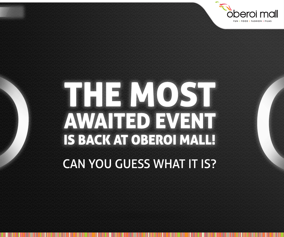
Here is what we get to know that the first creative is more product oriented as the brand wants to drive audience focus more towards the product rather then the text, the creative on the left is product-centric.
Whereas, if we have a look at the second creative, they have used the product image as a background image but want to completely drive your focus towards the text which follows us on Instagram and the brand name itself.
Here, If you notice the text into the creative has two parts first is follow us and second is the brand name with different font style.
Let’s have a look at one more creative.

What do you observe?
The above creative is made for a glass brand AIGMF where the focus of the creative is to convey the message “Ask for a Glass”
So the creator has used “Ask for” in a font style and has expressed the glass in the form of an Image.
Things you need to take care while creating a post for Social Media
Imagine you scrolling all around on your Facebook feeds.
You stop only when something attractive, creative or flashy stuff appears.
So, basically the gateway to a perfect creative is to give the same amount of importance to the fonts. Play with them ad think different.
Have a look at the creative below:

So, here you can see that the creative is catchy due to the yellow flashy colour it holds. Which may usually catch the users attention and after that the whole magic begins.
Once you have grabbed the attention it is natural that a user reads the content in the creative.
The above creative is a World Cup 50% off Sale Announcement Video Post.
After looking at the creative you may observe that the creator has made use of a goalkeeper boundary where it gives an insight that the post has some relation with football which conveys 50% of the information and the rest is done by the video.
Conclusion
So, we would recommend you to give an equivalent importance to the font as much as you give it to an overall creative. Most of the designers ignore the font and concentrate more on making the creative attractive where the objective of making a creative is to convey a message which is highly expressed in the form of fonts(words). 🙂
“Treat font as a Design Element ”
Would love to know your views on the article. 😉
One question, what parameters do you take into consideration while creating an amazing creative?
Follow Us
Nicely explained!